Bridgley
THE CLIENT
Bridgely helps facilitate child and initiative sponsorship around the world. But unlike other competitors, the journey doesn’t stop there. Bridgely fosters real relationships by allowing direct communication from community leaders and causes.

This project was completed with Made with Future, a design and development agency. I was the primary product designer for the project and collaborated with project managers, software developers, and the client.
September 2024 - March 2025
The Problem to Solve
Bridgely has a great mission but the app lacked any communication or clear UX flows to help guide the user through the process of joining a community, sponsoring a cause, and getting connected to what the community is all about.

Some questions users may ask upon opening the app (before redesign)
Project Impact
The goal was to clean up the app structure to find simpler patterns and clear communication of the app's purpose and function to the user. This aimed to improve user onboarding, increase engagement within communities, and ultimately drive more sponsorships.
This project lead to:
1. Clearer communication of the app's purpose and function to the user
2. Increased engagement within communities to drive more sponsorships

Key Issues Found in the Current Experience
(Screenshots before redesign)
Causes are things that users can sponsor such as children or causes (such as funding clean water, or rebuilding a school). Since the parent and child terms are the same, this causes confusion.
Main bottom nav tabs suddenly appear after the user has sponsored a cause. This unexpected change in main navigation doesn’t give the users a full sense of everything available in the app.
Value proposition for primary use cases aren’t isn’t clearly explain to the user. Call to actions then feel confusing or unnecessary.
Cluttered global (home) tab had no clear purpose and had content that didn’t provide context as to where it was coming from
The ‘sponsor a child’ flow doesn’t flow up with success upon entering credit card information. This could cause frustration and uncertainty to users.
TLDR: The app was riddled with issues that made it difficult for even our internal team to have clear conversations about what was what.
Design Solutions
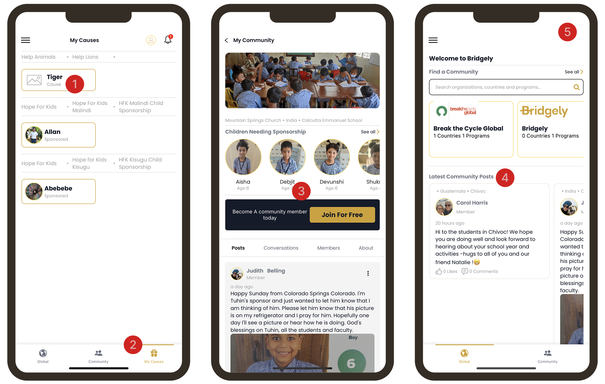
The Discover tab helps increase awareness about different communities around the world

Filtering such as country tags, and community types to help sponsor users understand where these communities are around the world and what type of causes they could support.

Community Facilitators now had a place for their posts to be shown to the public instead of the global feed being cluttered with all posts.

Instead of a single list of communities, categories and sections to encourage users to scroll and find new communities that they may be interested in supporting.
2. My communities tab helps sponsor take action to support causes
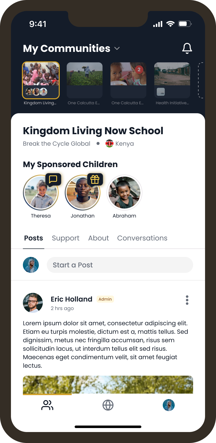
This tab is the home place for all the communities the user has joined.
Each community gets its own page/tab.
My sponsored causes live here or this section becomes a call to action to sponsor a child/initiative if the user hasn’t sponsored anything
Posts and all other content for the community live in these tabs, like the current app.
The updated design offers a more direct route for users to connect with and support specific causes, which better aligns the user experience with Bridgely's business goals.
Conculsion
Today, the full redesign is live in the app. The client is excited to see how their users reacted to these major improvements.
Some of the Final Screens

App restructure Diagram